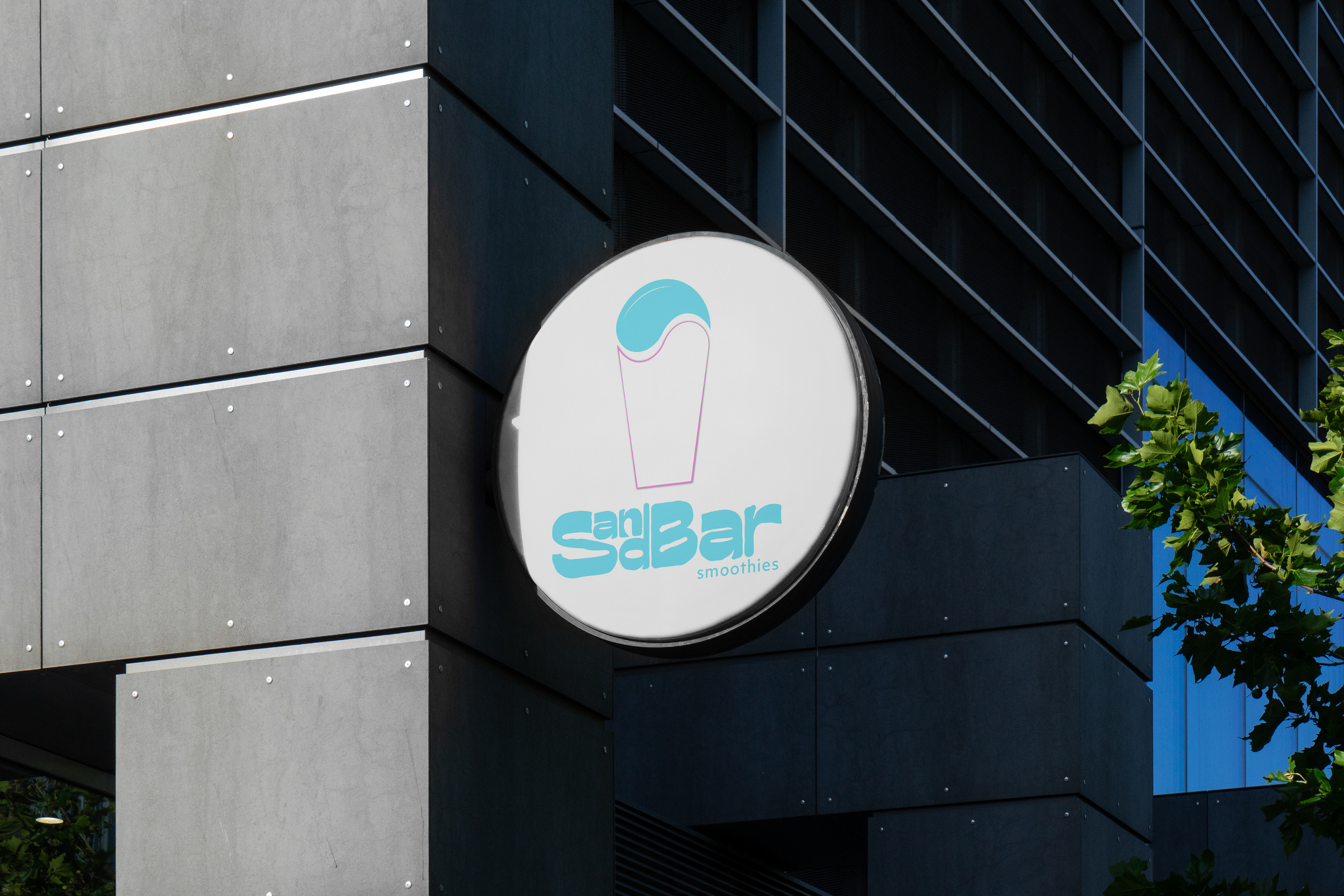
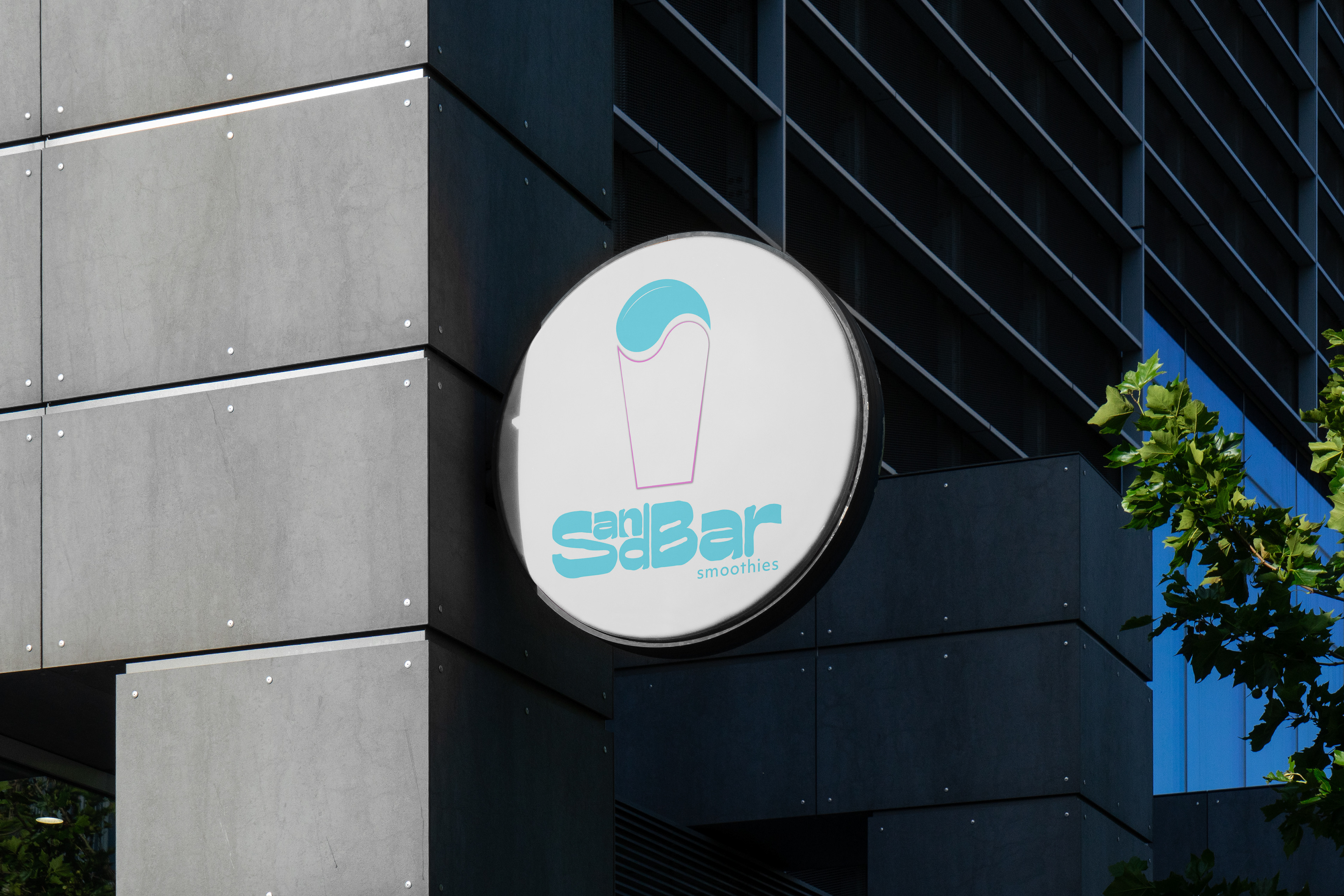
To get some practice with branding, I made a logo and word mark for a fictitious smoothie business. The name I came up with was SandBar Smoothies, and it's meant to be located near a warm beach. I wanted the branding to feel tropical and playful, but clean.
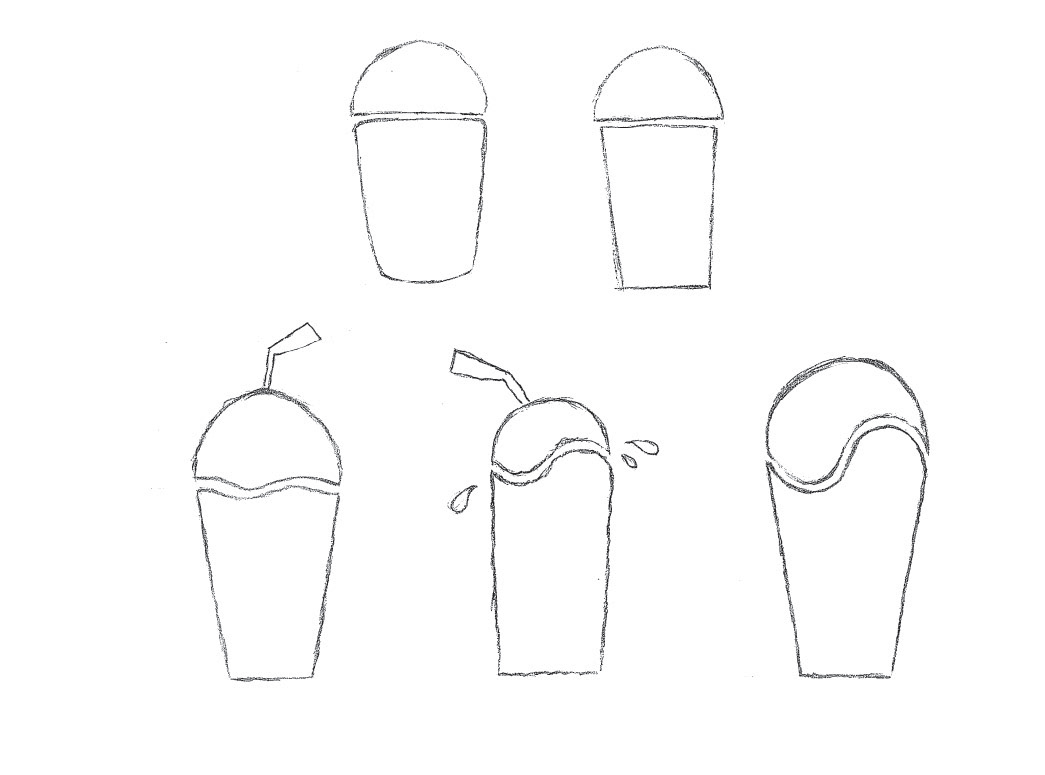
Logo Sketches
I started off exploring logo possibilities. I studied the logos of established smoothie companies to get inspiration. I tried out different ideas I had, and ultimately decided to push the one that was most visually interesting and appealing.
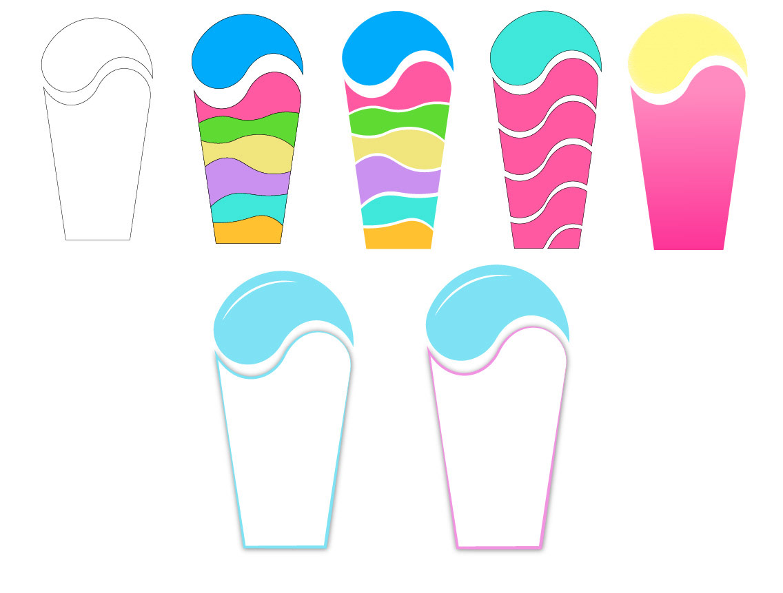
Digital Iterations
I experimented with different colors and patterns. I felt the logo looked too busy with all the extra colors, so I simplified it, using the top of the smoothie as a focal point since it resembles water, which pushes the tropical beach theme.
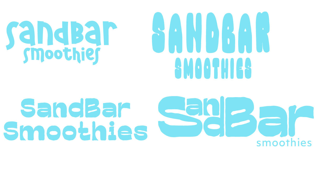
Word mark Explorations
I tried out different typefaces to find one that felt relaxed and inviting. Once I found one I liked, I manipulated the type to make it more interesting. My final word mark is friendly and welcoming while staying in line with the tropical theme.
Final Products